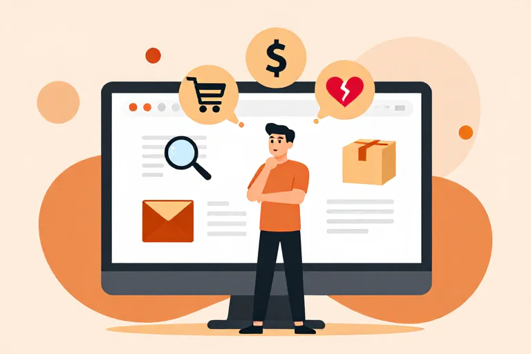
When someone lands on an ecommerce website, it is tempting to imagine a very simple journey:
See product → like product → add to cart → buy.
Real shopping is rarely that clean.
A shopper might spend thirty seconds on the homepage and decide the brand isn't for them.
Someone else might spend ten minutes comparing two products and still leave.
Another person might love the product, add it to their cart, and then open three other tabs to see whether they can find something similar for less.
From the outside, these visits can all look like different versions of “didn't convert.”
From the shopper's side, they're completely different decisions.
That is why I think it is useful to stop thinking about the shopping journey as a funnel for a moment.
Think about it as a sequence of questions.
The Shopping Journey Starts Before the Product
A shopper doesn't usually arrive thinking:
“Let's evaluate your website.”
They arrive with something already in their head.
Maybe they need a reading chair.
Maybe they're looking for a better dog bed.
Maybe they saw a lamp on Instagram and want to see what it actually looks like.
Maybe they don't even know exactly what they want yet.
That matters because the first question is rarely:
“Is this a good product?”
It is closer to:
“Did I come to the right place?”
This is why the homepage matters so much for a first-time visitor.
The shopper is trying to understand:
- What does this brand sell?
- Is this for someone like me?
- Is there something here that solves what I'm looking for?
- Do I want to spend another minute here?
A brand may think its homepage is very clear.
The shopper gets to the page and still has no idea what makes the store different.
That's not a design problem in the narrow sense.
It's a decision problem.
Step 1: “What Is This, and Is It For Me?”
This is the orientation stage.
It happens quickly, and often without the shopper consciously thinking about it.
Imagine arriving at a website that sells furniture.
The hero says:
Thoughtfully designed pieces for modern living.
It sounds nice.
But what does the shopper actually know now?
Not much.
They still don't know:
- what kind of furniture
- what makes the products different
- what price range to expect
- whether the style is relevant to them
- why they should keep browsing
Compare that with a store that immediately makes the situation obvious:
Small-space furniture designed for apartments and compact homes.
Now the shopper has something to work with.
They can either think:
That's me.
Or:
That's not me.
Both are useful outcomes.
The real problem is when the shopper can't tell.
Step 2: “Okay, I Found Something Interesting.”
Once the store makes sense, the shopper starts looking for something specific.
This is where the journey becomes more personal.
They may browse categories, filter products, search, or simply follow whatever catches their attention.
But even here, they're not just looking at products.
They're looking for relevance.
A product can be objectively good and still fail to create interest.
A product page might say:
Premium oak construction. Hand-finished. Solid joinery.
The shopper may understand every word and still think:
Okay. Why should I care?
What they are really trying to connect is:
Product → my situation.
Maybe the chair is compact enough for a small bedroom.
Maybe the lamp solves a lighting problem the shopper has been dealing with.
Maybe the storage unit finally fits an awkward corner.
The stronger the connection between the product and the shopper's actual situation, the less work the shopper has to do.
Step 3: “Why Is This Worth the Money?”
Now we get to one of the most interesting parts of ecommerce.
The shopper has found a product they like.
That's not the same as wanting to buy it.
This is where value gets tested.
Imagine two nearly identical products:
Option A: $49
Option B: $129
The more expensive product doesn't automatically need to be a bad deal.
But it does need to answer a harder question:
Why this one?
The shopper starts looking for evidence.
Maybe it's better made.
Maybe it lasts longer.
Maybe the materials are genuinely better.
Maybe the design solves a problem cheaper alternatives don't solve.
Maybe the brand offers something that reduces risk.
Or maybe the shopper finds none of that.
At that point, price becomes much more important.
This is something ecommerce teams sometimes misdiagnose.
They see:
“Customers think we're too expensive.”
But the deeper issue may be:
The page never gave the shopper enough reasons to believe the product was worth the difference.
Price is often where weak positioning becomes visible.
It isn't always the root cause.
Step 4: “Can I Believe You?”
Once a shopper is seriously considering a product, trust becomes much more important.
This isn't just about whether the website looks professional.
Trust is accumulated from a lot of small signals.
The shopper may look for:
- reviews
- product details
- real photos
- shipping information
- return terms
- guarantees
- company information
- clear policies
- answers to specific questions
But here's the part brands often miss:
People don't inspect these things in a fixed order.
A shopper may see something on the product page that creates doubt and immediately start searching for reassurance.
For example:
“This is a $300 product. What happens if I hate it?”
Now they're looking for returns.
Or:
“The product looks great, but I've never heard of this company.”
Now they're looking for reviews.
Or:
“It says handmade, but what does that actually mean?”
Now they're looking for details.
A good shopping experience doesn't simply contain the information.
It puts the right information close enough to the decision that the shopper doesn't have to go hunting for it.
Step 5: “What Could Go Wrong?”
This is the part of shopping that doesn't always appear in analytics.
A customer can be interested and still hesitate because the downside feels unclear.
For a $20 purchase, maybe that doesn't matter much.
For a $500 sofa, it matters a lot.
The shopper may be thinking:
What if the color looks different?
What if it doesn't fit?
What if delivery takes forever?
What if I need to return it?
What if the quality isn't what I expected?
This is why shipping and returns are not just policy pages.
They are part of the purchase decision.
The information might already exist somewhere on the website.
But from the shopper's perspective, “the information exists” and “I feel confident enough to buy” are not the same thing.
Step 6: “Is There a Better Option?”
This is where comparison enters.
Sometimes the customer doesn't leave because your product failed.
They leave because your product became one option among several.
This is especially common with products that are easy to compare.
A shopper can open Amazon, Google, another DTC brand, or a marketplace in another tab within seconds.
Now your product has to answer a different question:
Why should I choose this one?
This is where product differentiation becomes much more important than many CRO checklists acknowledge.
A cleaner CTA won't solve a generic product.
Better typography won't solve weak positioning.
Another trust badge won't create a reason to choose you.
Sometimes the biggest conversion problem is that the shopper doesn't see a meaningful difference between your product and the alternatives.
That isn't a UX problem.
It's a product and positioning problem showing up on the website.
Step 7: “Do I Have Enough Confidence to Buy?”
The final step isn't really about removing every possible doubt.
That's impossible.
There will always be uncertainty.
The shopper just needs enough confidence to move forward.
At this point, the decision might look something like:
I understand the product.
It seems relevant to me.
I understand why it costs this much.
I trust the brand enough.
I know what happens if something goes wrong.
I don't see a better alternative worth switching to.
Okay. I'll buy it.
That is a very different mental model from:
The CTA was visible, therefore the user should have converted.
The Buying Journey Isn't Linear
This is also why I don't think a shopper journey should be modeled as a neat sequence where every customer moves from A to B to C exactly once.
Real shoppers move backward.
They hesitate.
They compare.
They return to the product page.
They open the shipping policy.
They come back.
They look at reviews.
They check another product.
They change their mind.
They come back again.
A simplified model might look like:
Understand
   ↓
Explore
   ↓
Evaluate
   ↓
Question
   ↓
Reduce Risk
   ↓
Decide

     ↘ Compare
     ↖ Re-check
     ↖ Reconsider
This matters if you want an AI to simulate shopping.
The AI can't just be told:
“Visit the homepage, then product page, then checkout.”
That isn't shopping.
That's a script.
This Is Why Shopper Personas Matter
Two people can follow completely different paths through the same store.
Consider three shoppers.
First-time buyer
They have never heard of the brand.
Their biggest question is:
“Can I understand and trust this company quickly?”
They may spend more time looking for brand information, reviews, shipping details, and basic product context.
Price-sensitive buyer
They already understand the category.
Their biggest question is:
“Why is this worth the price?”
They are more likely to compare alternatives, inspect promotions, and look for evidence supporting the price.
Comparison shopper
They may already know exactly what they want.
Their question is:
“Why should I choose you?”
They are likely to pay closer attention to specifications, reviews, guarantees, differentiation, and competitive alternatives.
These aren't just three prompts with different names.
They're three different decision processes.
That is why a useful AI shopper should have a reason for behaving differently.
What Should an AI Shopper Actually Do?
At this point, I think the simplest useful definition is:
An AI shopper should try to make a buying decision, not just describe the website.
That means it should be able to:
Understand
Figure out what the store sells and who it appears to be for.
Explore
Find a product that fits the shopping goal.
Evaluate
Look at the product, price, proof, details, and value.
Question
Notice what is unclear or missing.
Reduce risk
Look for shipping, returns, guarantees, reviews, and other reassurance.
Compare
Ask whether there is a reason to choose this product over alternatives.
Decide
Reach a point where it can say:
I would keep going.
Or:
I would probably leave.
And when it reaches that conclusion, it should be able to explain why.
The Important Part Is What the Shopper Saw
I would be very careful about building an AI system that simply says:
“The product page feels untrustworthy.”
That's an opinion.
It becomes much more useful when it says:
“The product page makes a premium pricing claim, but the visible content provides limited evidence supporting the difference in price.”
And then shows what it saw.
For example:
Page:
Product page

Observed:
$189 price
“Premium handcrafted materials”
3 reviews
No visible material specifications near the purchase area

Shopper interpretation:
The product is positioned as premium, but the page gives limited evidence for the premium positioning.

Potential blocker:
Price justification
Now the merchant can investigate the problem.
That's much more useful than a score of 72/100.
One Shopper Can Be Wrong. That Doesn't Make the Exercise Useless.
This is an important limitation.
An AI shopper is a simulation.
It is not your actual customer base.
If one simulated shopper dislikes your headline, that does not prove your customers dislike it.
But a pattern is more interesting.
Suppose:
- the first-time shopper can't understand the product
- the price-sensitive shopper can't justify the price
- the comparison shopper can't find a strong reason to choose the brand
Now you're looking at something bigger than one model's opinion.
You're seeing several different buying perspectives point to the same underlying weakness:
The website explains what the product is, but not why someone should choose it.
That is the kind of signal worth investigating.
The Goal Isn't to Simulate Every Customer
I don't think that is realistic.
You don't need 100 artificial personas wandering around your store.
You need a few useful perspectives that expose different parts of the buying decision.
That's why I would rather have three shoppers with clear jobs than fifty vague personas.
The interesting question isn't:
“How many AI customers visited my store?”
It's:
“What did different buyers struggle to understand, justify, trust, or choose?”
That is much closer to the problem a merchant is actually trying to solve.
From Shopper Journey to Conversion Insight
Once you think about ecommerce this way, the role of an AI shopper becomes clearer.
It's not trying to replace your analytics.
It's not trying to replace real customers.
It's not trying to predict an exact conversion uplift.
It is giving you another way to inspect your store:
from the inside out, as the merchant sees it
versus
from the outside in, as a potential buyer experiences it.
And sometimes that difference is enough to expose something you completely missed.
Maybe your value proposition is too abstract.
Maybe the product is more generic than you thought.
Maybe your premium price isn't sufficiently explained.
Maybe shipping uncertainty appears at exactly the wrong moment.
Maybe your strongest differentiator is buried three screens below the thing the shopper is trying to decide.
These are not necessarily “website problems.”
They're buying decision problems.
And that is the reason I think simulating shoppers is worth exploring.
The Question I Would Ask Before Optimizing Anything
Before changing a headline, moving a button, adding another badge, or redesigning a product page, I'd ask one question:
What is the shopper actually trying to decide here?
Then ask:
What information do they need?
What could make them hesitate?
What would make the product feel more relevant?
What would make the price feel more justified?
What would make the alternative look better?
What would make them feel safe enough to continue?
Once you start looking at a store this way, ecommerce optimization becomes less about fixing pages and more about understanding decisions.
That's the part an AI Shopper is designed to explore.
Not:
“How good is your website?”
But:
“Could I actually make a buying decision here?”